
Beginners Guide to Designing a Blog

Beginners Guide to Designing a Blog
If you are just starting out or looking to freshen up your current blog you may feel overwhelmed with where to even begin.
You know that you need a blog that:
Is easy to navigate
Converts
Has a clean design and isn’t overcrowded with information
You are proud to call it your online home
The good news is that with some guidance, a little planning, and a lot of inspiration you can turn your blog into a space where people love hanging out.
Let’s dig in step-by-step, shall we?
My biggest tip when designing your blog is to take it one section at a time.
For example, avoid hopping around your site designing random things when you feel like it. Jumping all over the place leads to frustration, being overwhelmed, and before you know it you’ve given up.
Below I’ll take you through each section in your blog and give you design tips, advice, and what to avoid.
Navigation Design
Let’s start at the very top of your blog. You might think navigation design isn’t that big of a deal and you might not spend a whole lot of time worrying about it.
However, when it comes down to it your navigation is one of the most important things on your blog. It directs people to different areas on your blog. If your navigation is hard to find, doesn’t stand out, and is cluttered you are missing out on people diving deep into your site.
Advice
When putting together your navigation you want to keep it minimal while including your most important links.
Here is an example of my navigation
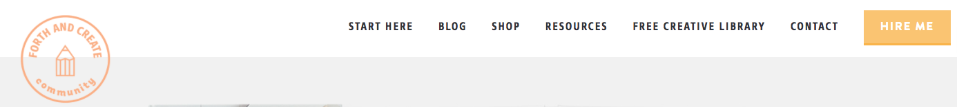
My blog has a Start Here page so I avoid adding blog categories in my navigation. I could have my categories in a drop down menu under the blog link, however, I prefer my categories in my sidebar. This is personal preference.
I would avoid having eight or more links in your navigation, you don’t want to overwhelm your readers which too many choices.
If you offer services or if you have a product you want people to check out I would suggest making it more prominent so it catches your reader’s eyes. I want people to hire me for their design needs so I have it sitting on top of a bright yellow button.
Design Tips
When it comes to designing your navigation menu you want to make sure it’s readable and noticeable.
A good and safe option is to have it sit on a white background with black text or a dark colour or on a black background with white text.
And finally, make sure your fonts are readable. Avoid using text that is too small or too large. You should also avoid using script fonts as they are very hard to read on-screen. A sans-serif is your best option.
Header Design
A header image is a great way to get people to sign up for your service or opt-in to your freebie.
Most of my subscribers are brought in from my header opt-in.
Check out my design below.

Advice
You are going to want to promote your best freebie or service in your header. For example, if you are currently trying to get people to sign up for your opt-in that will eventually lead to promoting your upcoming course to them then you most definitely want to promote that free opt-in in your header.
Personally, I try and keep my header promotion on every page on my blog. People generally need to see something several times before they decide to take action.
Your free opt-in is the next step after your reader finishes your blog post. For example, if you have a blog post on, how to bake the best chocolate chip cookies ever. Your free opt-in might be a grocery store checklist for the ingredients needed to bake the cookies.
A free opt-in can be as simple as a checklist, a workbook, a video series, a PDF download of your blog post, etc.
My current opt-in is a list of 60+ design resources that I love. This does extremely well and people love learning about new tools.
Design Tips
In this case, you want people to notice your opt-in so using bright colours and being flashy is okay just don’t be obnoxious.
Bright colours like yellow draw your readers in.
For my header, I didn’t go for a flashy bright design but I did include a big yellow button and a preview of the freebie. Having a preview of your item is proven to get higher convert rates.
The one thing to remember is you have only a few seconds to catch your reader's eye before they move on so keep your headline short and catchy.
Sidebar Design
If you decide you want a sidebar on your website there are a few things to keep in mind.
Advice
People who decide against sidebars usually have the same reason, they want their reader’s to focus on only their blog content and not get sidetracked with sidebar clutter.
Although I totally agree with their reasoning, personally I’m a sidebar gal. I love having the extra space to promote and organize items.
If you are going to have a sidebar it’s important not to clutter it
These are a few things I suggest having in your sidebar:
Your photo
A short bio
Categories
Social media icons
Search bar
And a content upgrade / service you want to promote
That’s it.
Things you should avoid in your sidebar are:
Flashy gifs
Ads
Long lists
Too much text
Grab my blog button
Too many widgets
I even suggest leaving out your Instagram photos, a good place to put them is in your footer.
Design Tips
First things first, make sure your photo is bright and professional looking.
Having a professional looking photo doesn’t mean you need to spend hundreds on a portrait session. Take your smartphone, stand in some natural light and snap that photo. Dark, grainy photos are unattractive and make your blog look unprofessional.
Check out my sidebar design below. I took my photo with my iPhone, standing against a white door in the sunshine.
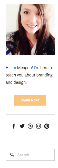
Next up, keep your long lists in a drop down menu. For example, I have archives in my sidebar and I keep it nice and hidden in a drop down menu.

And finally, avoid using too many flashy colours. Too much flash is very distracting and it will distract your reader from your content and make it very hard for them to focus.
Footer Design
Your footer is a great place to add things to grab your reader’s attention one last time.
It’s a great place to house things such as:
Your FAQ page link
Your privacy policy page link
Your instagram widget
Contact Form
And social media icons
Advice
You want to avoid link overload, much like your main navigation you want to only include important links. Instead of putting your privacy policy, FAQ, and copyright info in your main navigation your footer is the perfect alternative.
Here is an example of my footer

As you can see I’ve added an opt-in freebie in my pre-footer section. This converts really well and it brings in a lot of new subscribers.
I would suggest using a completely different opt-in freebie than the one in your header. If people aren’t interested in your header opt-in they might be interested in your footer opt-in. Always give as much variety as possible.
Design Tips
It’s important to remember your footer isn’t your attic. Don’t just throw in anything and everything because you couldn’t find a place for it on your site.
Keep the design simple and clean. You want your footer to breath and not feel cramped.
When designing my footer I like to keep the items in a grid format. Whether it’s a horizontal or vertical grid it lays out each item nicely.
If you are looking for footer inspiration I suggest checking out Dribbble. https://dribbble.com/search?q=footer+design
I hope this post has helped you! Just remember less is more, keep things clean, organized, and breathable.
Happy designing!

